DATE
30/01/2025
A Modern, Scalable Brand for a Solar Solutions Company
SolarSync connects homeowners with custom solar panel setups based on their energy needs. We created a clean, modern brand identity that reflects sustainability, trust, and forward-thinking tech starting with a distinctive logo and visual system.
Brand Identity
Logo Design
Services
Logo Design · Brand Identity · Visual Direction
Category
Sustainability · Clean Tech · Renewable Energy
Client
SolarSync


Branding That Reflects Clean Energy and Custom Solutions
SolarSync needed a visual identity that could communicate both clarity and innovation something that would resonate with eco-conscious homeowners and feel trustworthy from the first glance.
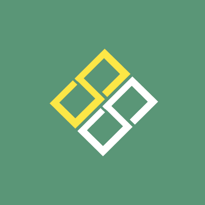
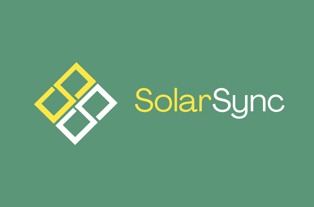
Logo designed for adaptability and recall.
The symbol combines clean geometric lines with a subtle nod to solar movement and energy transfer simple, scalable, and strong in both color and monochrome formats.
Color and typography inspired by modern sustainability.
We selected a fresh, earthy color palette and a clear, modern type system to ensure the brand feels approachable, tech-forward, and environmentally grounded.

Designed to Work Across Digital and On-Site Applications
The identity system was crafted to work across multiple formats from website headers and mobile apps to vehicle decals and sales brochures.
A flexible visual system for long-term brand growth.
Whether SolarSync is scaling into new regions or marketing to new audiences, the brand is equipped to maintain consistency and clarity everywhere.
A Brand Built to Inspire Energy Confidence
SolarSync’s mission is to help homeowners navigate solar with ease. We translated that into a brand identity that’s approachable, optimistic, and built to lead in a competitive market.
Every visual element builds trust, from logo to layout.
The result is a brand that feels simple but smart designed to stand out in the solar space while building credibility from the very first interaction.